How to Ensure Your Final Print Product Meets Your Expectations

Share

Managing print expectations

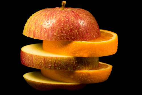
Sometimes comparing your print expectations to the final product can feel like comparing apples and oranges. Here’s a simple guide to making sense of the process. Image Source: Flickr


Disparity between proof and press is a subject that comes up from time to time in the world of commercial printing.

Ideally, whatever you see in an original photo or as original artwork on your computer screen would translate perfectly to ink or toner on paper. The reality, however, is slightly less than ideal. Our goal in printing is to account for as many variables as possible in order to minimize perceived differences between media and reproduction processes. In the end though, it is important for the customer to understand the limitations of printing in order to have a reasonable expectation of the final product.

To understand the problem a little better we can look at the process of scanning and printing an original photograph on press.

Step One

Digitize the photo. This involves either scanning or digitally photographing the original photo. To capture a continuous tone image the scanner or digital camera records three color filtered channels of light and breaks the image into millions of individual color dots. The result is an RGB (Red, Green & Blue) image. The RGB colorspace has a wide gamut of color (number of colors that can be reproduced) but the gamut is smaller than what the human eye can perceive. So the very first step in the process introduces a limit on the amount of color information that can be recorded.

Step Two

Color correct the scanned image. This is required because the white point of the original photo stock can vary as greatly as the color content of the image does. Compensating for white point and color balance after the scan allows us to capture more of the fine tonal range of the original image. Step Two then will rely heavily on how your computer monitor displays the image. It’s very important to work from a device that is closely calibrated to the final output condition that you expect. In this case, the image will be printed in Four Color Process on an offset press so your monitor’s white point and color gamut should be set to reproduce the look of ink on paper.

But here’s the first big problem of designing with a computer: the monitor is brightly back lit, transmitting light though a field of colored dots. This is referred to as transmissive light. By contrast, the original photo and the final printed sheet both use reflective light. That is, light bounces off of the image. A reflective image by its very nature will always be duller or less vibrant than a backlit image. So Step Two introduces incompatibility of media. Your monitor and a printed image display images using very different principals. If we don’t color correct the image to replicate how it will look when it is converted back to a reflective image, there will be no way of accurately reproducing the product.

Step Three

Proofing. Since it is unlikely that a customer will have an monitor that is accurately calibrated for offset printing, it is necessary to print a hard copy proof if you wish to evaluate image quality and color. The first problem with Step Three is that the majority of the cost of printing the final product lies in the initial setup of the printing press. This “make ready” process is expensive and time consuming and printing a complete proof on an offset press would almost double the cost of most jobs. The workaround is to print on a device that is much easier to set up that can still produce a quality image. Typically a digital press or a large format inkjet printer will be used to make a hard copy proof. Both of which use entirely different printing processes than offset printing. Just like color correcting on a monitor, we need to shift the output color of each device in order to match as closely as possible what we would expect to see when printing offset. The inks used in offset printing and the toner in digital press have almost no printing qualities in common, and each is received differently by the substrate. This makes replication difficult but not impossible.

Another issue is that we have an RGB image for display on a monitor that now needs to be converted to a CMYK based reflective image. And unfortunately the reproducible color range of RGB and CMYK color spaces is different. Some colors translate easily while others will shift rather dramatically. For instance very bright electric or pastel colors display well in RGB but will noticeably color shift when converted to CMYK for final print.

Step Four

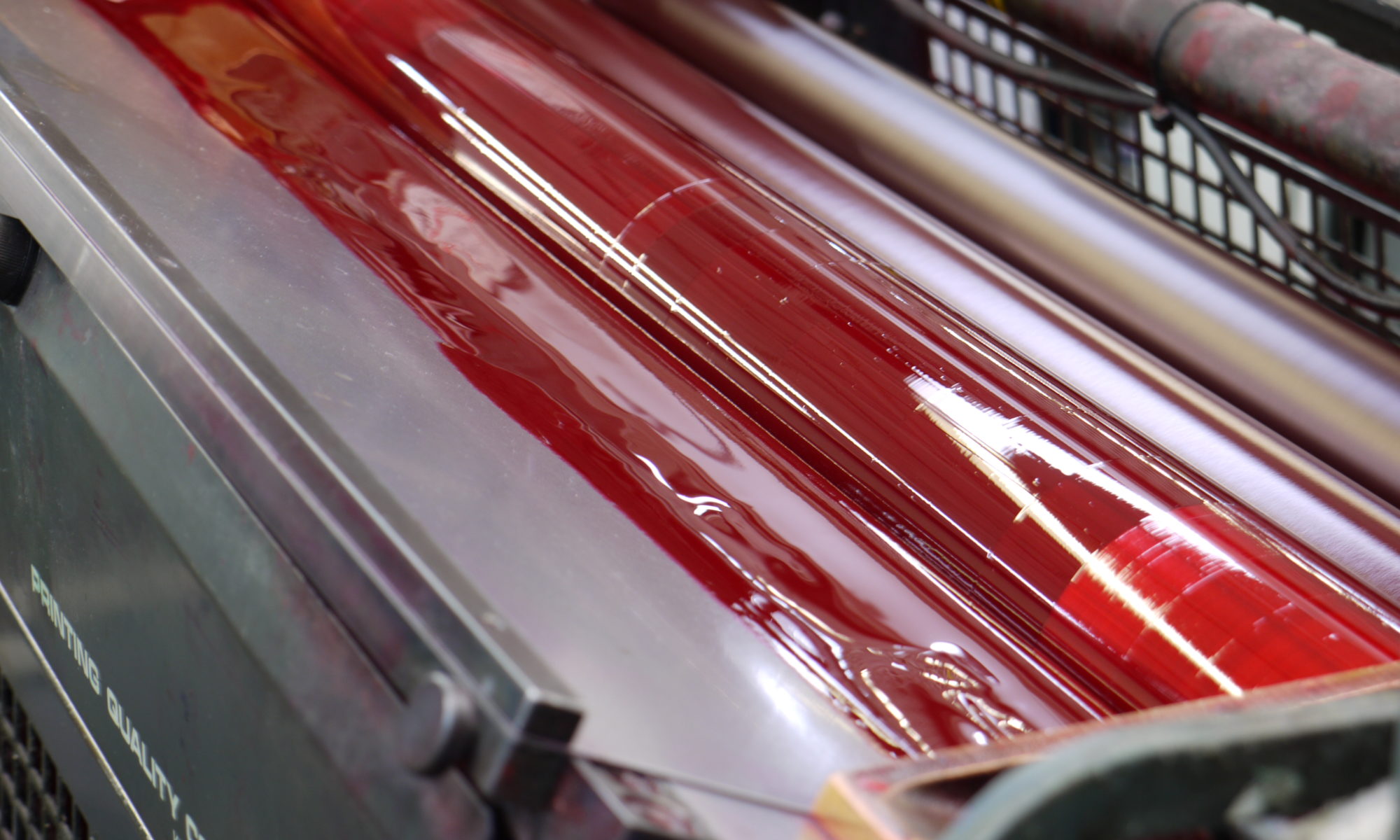
Move the job to press. Offset printing is really as much of an art as it is a science. There are an enormous number of variables in recreating an image with ink on paper. Calibration, registration, ink type, fountain solution, dot gain, hold out, toning, drying, ink keys, ink density, and on and on. A skilled pressman can evaluate these variables during the make ready process and quickly dial in a high quality final image. He will use standardized settings as a starting point but will need to make changes to most of those variables to arrive at the final sellable product. And as the job runs and consumable levels change, so does the printed image. The pressman needs to constantly monitor and tweak the image to account for the moving target of color.

All of this is to express how remarkable the printing process truly is. Offset printing is comprised of a number of different and opposing processes that result in a product that most take completely for granted.

Paper Brightness, Whiteness & Shade: Definitions and Differences

Share

Paper Brightness, Whiteness and Shade

Paper brightness, paper whiteness and shade are three of the most often misunderstood variables of paper choice in print projects. However, they all play an important role in determining the look of your final product.

While it’s easy to have a general idea of what the terms brightness, whiteness and shade mean, there can be quite a bit of confusion as to their technical definitions and how they affect the appearance of your final product.

It should be noted that though paper brightness and whiteness are somewhat similar, they are not interchangeable.

Paper Brightness

Brightness measures the amount of reflectance of a specific wavelength of blue light. Brightness is measured on a scale of 0 to 100 – the higher the number, the brighter the paper.

In other words, 95 bright paper reflects more light than an 85 bright paper, therefore appearing brighter.

Using the specific blue light to measure this reflection ignores longer wavelengths, including green and red. Because of this, two types of paper with the same brightness can visually appear very different, even though their “brightness” is the same.

Specifically, the blue light used to measure brightness has a wavelength of 457 nanometers (nm).

Paper Whiteness

Whereas brightness measures the reflection of a very specific wavelength of light, whiteness measures the reflection of all wavelengths of light across the visible spectrum. Because of this, the whiteness measure is more in line with our visual perception.

So, there will generally be a consensus that the higher the whiteness rating (which also uses a 0-100 scale), the whiter the paper.

Using the entire spectrum of visible light, paper with a very high whiteness number can appear to have a blue tint depending on what light source it is viewed under.

The most common whiteness measure, D65 illumination, represents outdoor daylight. This standard is called CIE Whiteness and was developed by the French-based International Commission on Illumination (also abbreviated CIE). Indoor lighting, of course, will change how white the paper appears, and this will vary even more between fluorescent and incandescent bulbs.

Paper Shade

Shade, on the other hand, does not take into account any light reflection; instead, it represents the color of the paper. There are three common groups of white shades:

True White
Blue White
Cream White

As noted above, often the blue white shade is used for paper because it appears to be a “whiter” white than true white. These papers are often labeled “bright white” or “high white.” It has this tint because it reflects more blues.

Cream white absorbs the blues that blue white reflects, and therefore has a yellowish look. True white, as it name would suggest, reflects the entire color spectrum equally, which of course is the true definition of white.

Shade choice is particularly important in book printing. In addition to taking your own preference into account, you also want to make sure the shade of your paper provides visual comfort for your readers. The best choice for this depends largely on the content of your book. If you are interested in book printing, find out more at our book printing division, BestBookPrinting.com.

When Brightness and Whiteness Go Off the Charts

If you’ve looked at a variety of paper, you may have seen brightness and whiteness levels going above the 100 scale mentioned earlier.

The 100 limit is for standard paper made only with pulp. However, additives may be added to make the paper appear even brighter or whiter.

These additives are known as Optical Brightening Agents (OBA), and in reference to brightness they reflect ultraviolet – or UV – light as visible light. In other words, this is reflecting more visible light than the actual light source emits.

Similarly, fluorescent OBAs will cause whiteness values to increase above 100.

North American Paper Standards

Outside the paper industry and print industry, paper brightness is the most common measuring standard in North America. The 0-100 scale is typically based on the Technical Association of the Pulp and Paper Industry’s TAPPI Standard T451. Regions outside North America commonly use the International Organization for Standardization’s ISO Standard 2469.

As mentioned above, the standard for Whiteness measurement is CIE Whiteness.

Again, though whiteness and brightness have similarities, the measurement systems used to measure each are completely independent of each other and are not at correlated.


Premedia – How it Relates to Prepress

Share

Premedia

Premedia has become a commonly used phrase in print shops and other creative offices around the world. However, it is not always immediately clear what this relatively new term means.

For printers in particular, the term is often confused with the more common (and traditional) prepress. Though the two are not interchangeable, they are related in that prepress is a specific type of premedia process.

What is Premedia?

Premedia is anything that happens to a piece of artwork to take it from its original state when completed by the creator to a form that is ready for public consumption. This can range from color correcting a photograph to placing audio effects on a song file to preparing a PDF for printing.

One of the causes of confusion about premedia is that its definition is so broad – but this is purposeful to include a large variety of media.

Premedia in Relation to Prepress

When a client presents their artwork to be printed, anything done by the printing company between receiving the art and actual going to press is the prepress process. Because prepress is a specific type of premedia, prepress activities are also a premedia process.

However, since premedia is inherently designed to include multiple media, it is not only restricted to prepress (or the print industry). A photography company taking a raw photo from a photographer and enhancing the image and then developing and printing it is also taking part in a premedia process. If the company only enhances the image for digital use, it is still a premedia process even though there is no physical material produced. In this case, the completed and enhanced digital file is the final product of the premedia process.

For more on prepress, see our extensive prepress article over at bestbookprinting.com, our book printing division.

History of Premedia

The term was initially created as a way to describe the processing of the newly emerging digital and web communications in much the same way that prepress has been used for so long to describe the print production process. Before premedia, there was no word for the digital production process.

The definition has been left intentionally broad to encompass not only existing media and delivery output channels, but also any that emerge in the years to come.